Fifty milliseconds. That's a fraction of a blink. In studies by researcher Gitte Lindgaard, people rated how appealing a website looked after glimpses as short as 50 milliseconds, and their snap ratings matched their considered ones. A visitor has a gut reaction before you get a word in. You haven't had a chance to explain your 30 years of experience. They haven't read your glowing testimonials. They just... felt something.
And here's the genuinely alarming part: a 2002 Stanford study of thousands of web users found that "design look" was the most common thing people mentioned when judging a website's credibility, in about 46% of comments (summary). Visitors weigh your design before they read your prices.
If your website looks like it was built in 2009, your visitors are reaching a 2009 conclusion about your business — no matter how good you actually are.
7 Telltale Signs Your Website Is Killing Trust
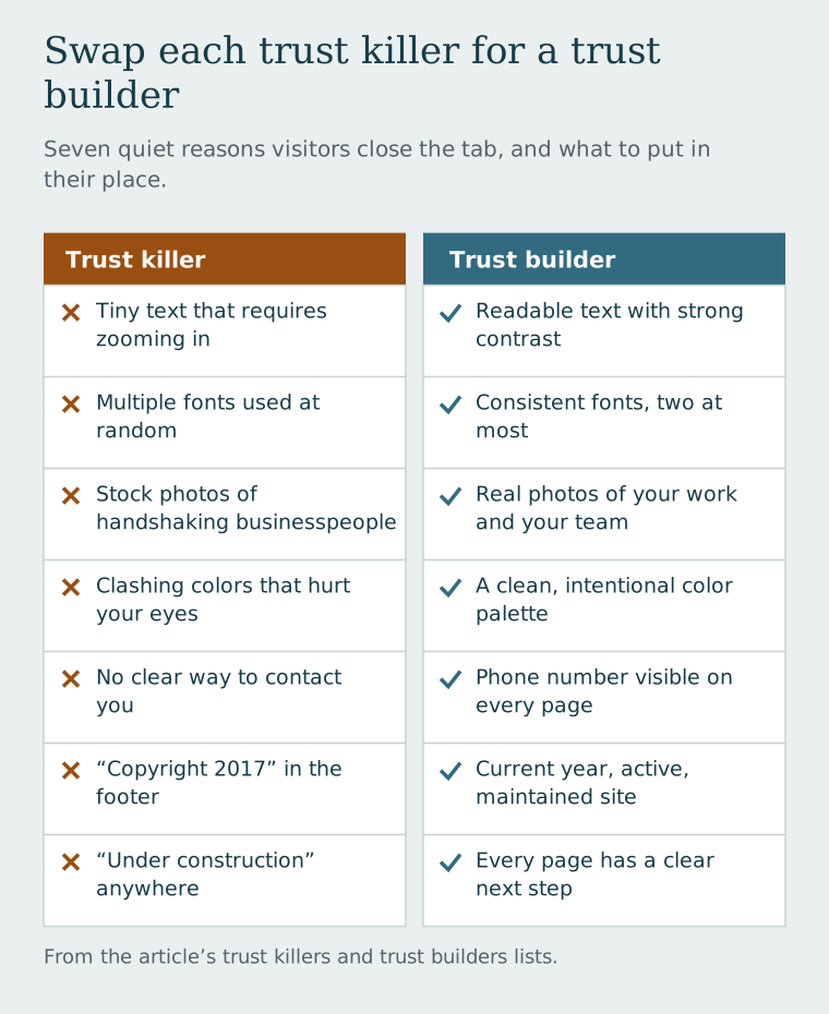
Here are the design red flags that make visitors quietly close the tab and go find someone else:
Trust Killers:
- Tiny text that requires zooming in
- Multiple different fonts used randomly
- Stock photos of handshaking businesspeople
- Clashing colors that hurt your eyes
- No clear way to contact you
- Copyright says 2017 in the footer
- "Under construction" anywhere on the site
Trust Builders:
- Readable text with strong contrast
- Consistent fonts (max 2) throughout
- Real photos of your work and your team
- Clean, intentional color palette
- Phone number visible on every page
- Current year, active, maintained site
- Every page has a clear next step
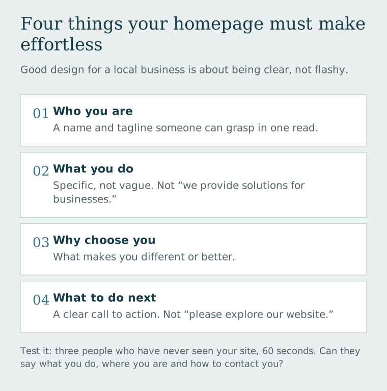
The "It Looks Fine to Me" Problem: You see your website the way you see your own handwriting — it all looks perfectly clear because you know what it says. Get three people who've never seen your site to spend 60 seconds on it and tell you what you do, where you're located, and how to contact you. You may be surprised by the results.
What "Good Design" Actually Means for a Small Business
Good design for a local business website isn't about being trendy or flashy. It's about being clear. The goal is to make it effortless for a visitor to understand:
- Who you are — In a name and tagline they can grasp in one read
- What you do — Specifically, not vaguely ("we provide solutions for businesses")
- Why they should choose you — What makes you different or better
- What to do next — A clear call to action that isn't "please explore our website"
That's it. If your homepage accomplishes those four things in a clean, professional-looking way, you're already ahead of the majority of your local competitors.
The "squint test": Load your homepage and literally squint until the words are blurry. Can you still tell where the most important button is? Is there a clear visual hierarchy? If everything looks equally important, nothing is. Good design uses size, color, and spacing to guide the eye automatically.
Real Photos Beat Stock Photos Every Time
We cannot stress this enough: get real photos. A photo of an actual human being who works at your company — even a decent smartphone photo with good lighting — will usually do more for trust than a stock image of two professional people shaking hands in front of a generic glass building.
Authenticity is a trust signal. And your customers can tell the difference between "that's actually them" and "that's definitely a model they downloaded from a website."
Not sure what visitors think of your site?
We'll review it with fresh eyes and give you a plain-English report on what's working and what's sending people away.