
There's a specific kind of torture that every small business owner has accidentally inflicted on their customers: a website that requires two-finger zooming, horizontal scrolling, and the reflexes of a surgeon to tap the right button on a mobile phone. You've probably experienced this yourself on someone else's site and thought "wow, get it together."
And yet, a startling number of local business websites still deliver exactly this experience to the majority of their visitors — because the site was built or last updated when everyone was on a desktop computer, and nobody got around to fixing it for the era of smartphones.
That era is now. Actually, it's been now for about ten years. But there's no judgment here — just a strong nudge to check your site on your phone right now and see what your customers are actually experiencing.
What "Mobile-Friendly" Actually Means
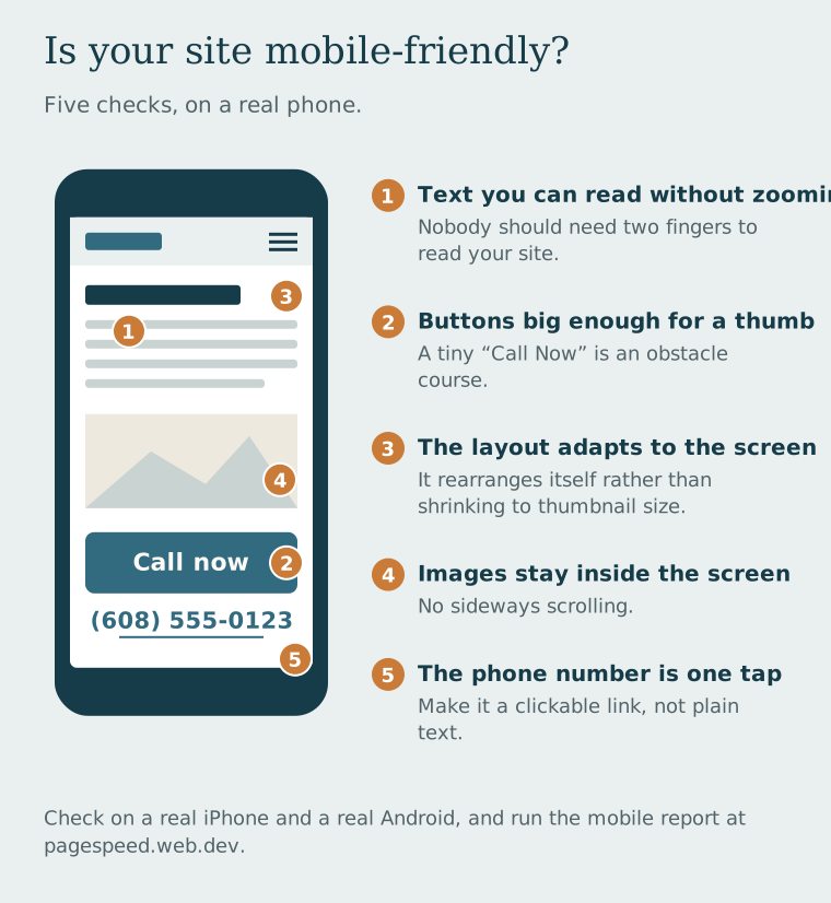
"Mobile-friendly" gets thrown around a lot. Here's what it actually looks like in practice:
- The text is readable without zooming. This sounds obvious. It is shocking how many sites fail this.
- Buttons are big enough to tap. If your "Call Now" button is smaller than someone's thumb, it's not a call to action — it's an obstacle course.
- The layout adapts to the screen size. A "responsive" website rearranges itself elegantly on small screens rather than just shrinking everything down to thumbnail size.
- Images don't overflow the screen horizontally. Horizontal scrolling on a phone is one of the most infuriating user experiences possible. It says "this site was not made for you."
- The phone number is clickable. When someone is on their phone and wants to call you, they should tap the number once. That's it. If it's just text, you just added friction to the most important action on your website.
The Google "Mobile-First" reality check: Google now indexes the mobile version of your website first, which has been the default for new sites since July 2019. Not the desktop version. A site that looks great on a laptop but terrible on a phone is being judged on the terrible version. This means a non-mobile-friendly site isn't just bad for visitors — it can hurt how you show up in search.
Local Business + Mobile = Urgent
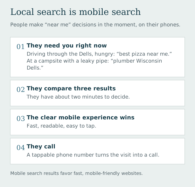
Here's something that makes mobile even more critical for local businesses specifically: people use their phones to make "near me" decisions in the moment. They're driving through the Dells, hungry, and searching "best pizza near me." They're at a campsite with a leaky pipe, searching "plumber Wisconsin Dells." They have two minutes to make a decision, they're looking at three results, and the one with a clear mobile experience wins.
Local search is inherently mobile search. And mobile search results favor fast, mobile-friendly websites. Getting this right isn't about being tech-savvy — it's about being available to customers when they're actively looking for you.
Test yours right now: Google retired its free Mobile-Friendly Test in December 2023, but you can still check your site on a phone at pagespeed.web.dev (run the mobile report) or with Chrome's Lighthouse. It takes about a minute. If your site struggles, that's information you can act on.
The Easiest Mobile Wins for Existing Sites
If a full redesign isn't in the cards right now, here are the high-impact fixes that help most:
- Make your phone number a tel: link. Change your number from plain text to a tappable link.
- Increase font size to at least 16px. Smaller than that requires zooming on most phones.
- Add a sticky header with your phone number or "Book Now" button so it's always visible as people scroll.
- Compress all your images. Large images on mobile use data and slow load times dramatically.
- Test on an actual phone. Use Safari on an iPhone and Chrome on Android — different browsers render things differently.
These aren't glamorous. But they're the difference between a website that works for the majority of your visitors and one that silently frustrates them into calling someone else.
Let us check your mobile experience
We'll test your site on multiple devices and show you exactly what your mobile visitors are seeing — then fix it if it's not good enough.