Your human salespeople are great. But they go home at 5pm. They have bad days. They're at capacity. They can only be in one place at a time. Your website, if done right, has none of these limitations. It can simultaneously answer the questions of 500 potential customers, walk them through your offerings, build trust with testimonials and photos, and hand them a dead-simple path to contact you — at 2am on Christmas morning if that's when they happen to be planning their project.
The question isn't whether your website could do this. The question is whether it actually does. And for most local business websites, the honest answer is: not really.
The 3 Things Every Business Website Must Do
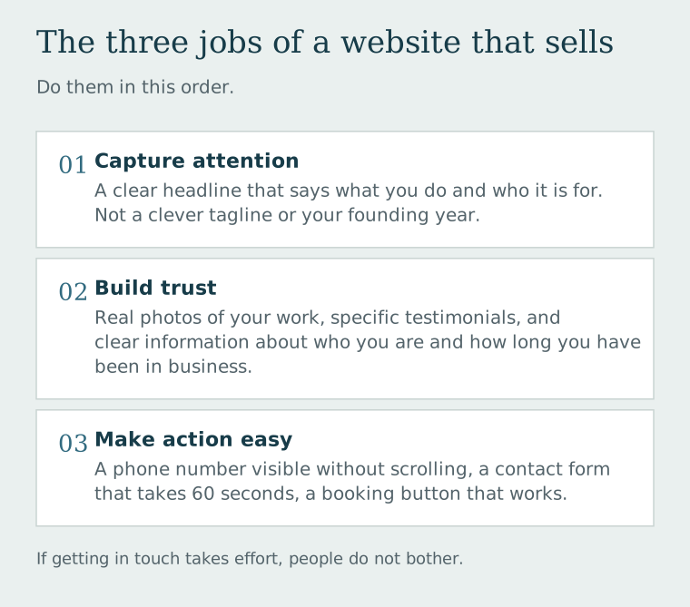
Most business websites focus on looking nice. That's table stakes. The sites that actually generate business are designed to do three specific things in a deliberate sequence:
- Capture attention — With a clear headline that explains what you do and who it's for. Not a clever tagline. Not your company's founding year. The answer to: "What do you do, and why should I care?"
- Build trust — Through real photos of your work, genuine testimonials (not "Five stars! Great service!" — specific ones), and clear information about who you are and how long you've been in business.
- Make action easy — A phone number that's visible without scrolling. A contact form that takes 60 seconds to fill out. A booking button that actually works. If getting in touch requires effort, people don't bother.
The #1 conversion killer on small business websites: Unclear calls to action — or none at all. We see sites where the entire homepage leads to... nothing. No button. No form. No visible phone number. The implicit message is "we have a website, now you figure out what to do with it." Visitors need to be told what to do. Make the next step obvious and easy.
What a High-Converting Website Actually Looks Like
Here's what separates a website that generates leads from one that just exists:
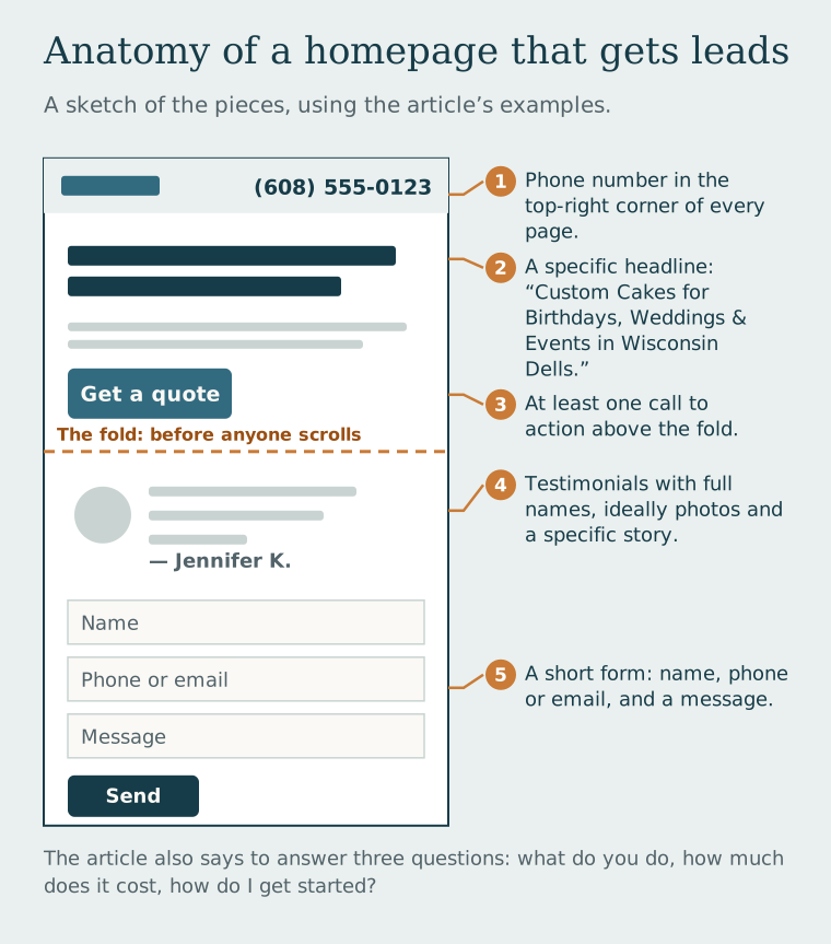
- The phone number is in the top-right corner of every page, large enough to read without glasses
- The homepage headline is specific: "Custom Cakes for Birthdays, Weddings & Events in Wisconsin Dells" beats "We Love Baking!"
- There's at least one call to action above the fold (before anyone scrolls)
- Testimonials include full names and ideally photos — "—Jennifer K." is fine; a headshot and a specific story is far more convincing
- The contact form asks for only what's absolutely necessary — Name, phone/email, and a message. Not their life story.
- There are clear answers to the three questions every customer has: What do you do? How much does it cost? How do I get started?
A 60-second test for your website: Have someone who doesn't know your business visit your homepage for 30 seconds, then close the tab. Ask them: What does this business do? How do you contact them? Would you feel comfortable hiring them? The answers will tell you exactly what your site is and isn't communicating.
The Overnight Employee You're Not Paying
Here's the mindset shift that changes how business owners think about their websites: stop thinking of it as a brochure and start thinking of it as your best employee. Your best employee doesn't just hold information — they actively sell, answer questions, build relationships, and hand off warm leads to you. They're tireless, consistent, and endlessly patient with the same FAQ at midnight.
That's what your website can be. And unlike a human employee, it doesn't ask for a raise, take sick days, or leave for a competitor. The investment is upfront. The return compounds over time. And the only question is whether yours is currently earning its keep — or just collecting digital dust.
Ready for a website that actually works?
We build websites for Wisconsin businesses that do more than look good — they bring in customers, answer questions, and generate leads while you sleep.