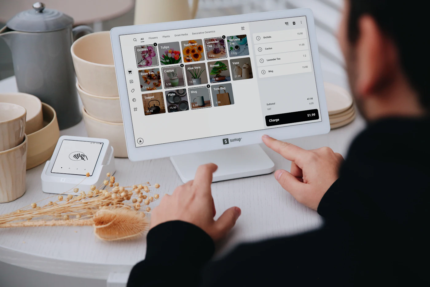

When I look at a website, I pay attention to where my eye goes first. Can I tell what matters? Is the text comfortable to read? Does the next step feel obvious? Those questions tell me more than the number of effects on the page.
I like a clean aesthetic, but clean does not have to mean empty or generic. A site can have character through its type, proportions, color, photography, and language. The important part is getting those decisions to work together.
Give each part of the page a role
Visual hierarchy is simply the order in which a design asks for attention. I want a headline to introduce the idea, supporting text to explain it, and a button to offer an appropriate next step. If everything is equally bold, brightly colored, and boxed in, the visitor has to work out that order alone.
In the example below, the words are deliberately similar. The difference is how they are organized. The clearer version groups related information and makes the action easy to find. It is a design demonstration, not a measured conversion test.
LAWN CARE • LOCAL • CONTACT US
Weekly mowing. Wisconsin Dells & Lake Delton. Get an estimate. Reliable service. Learn more. Call today.
Your lawn.
A little less work.
Weekly lawn care in Wisconsin Dells and Lake Delton.
These are static examples, not working forms or claims about conversion rates.
Choose typography for the reading job
A distinctive headline can give a site personality. Body text has a longer job to do: it needs to be comfortable across paragraphs and screen sizes. I would test the actual words, including long service names, rather than choose fonts from a specimen that only says “Hello.”
I also look at line length and line spacing. A paragraph stretched across a wide desktop screen can feel tiring. Text squeezed into a narrow column can break into awkward fragments. There is no single setting that solves every layout; I want to read it at the sizes people will actually use.
The underlying document matters too. Real headings give a page structure that assistive technology can navigate. I use heading levels to describe the relationship between sections, rather than choosing a heading just because its default size looks right. The W3C headings guidance explains that relationship.
Let spacing explain what belongs together
Space is part of the information. A label placed close to its input looks connected to that input. A larger gap before a new section signals a change of subject. Repeating a small set of spacing values helps those relationships feel consistent.
I would not add empty space just to make a page seem expensive. On a phone, too much space can push useful information far away. I want enough room to make the page understandable without making the visitor scroll through a presentation before finding an answer.

Use color and photographs with purpose
Color can guide attention, but it should not be the only way information is communicated. A form error needs a useful explanation as well as a color change. Buttons need a readable label, and links need to be recognizable in their context.
For photographs, I look for relevance before decoration. A real project image can answer questions about the work. A stock photo can set a mood or illustrate a topic, but I would not present it as a client, a team member, or proof of a result. That distinction matters to me.
Check the design while using it
I would review the page with a keyboard, on a narrow screen, and with real content. A layout that looks beautiful in a still image may behave poorly when a heading wraps or a visitor enlarges the text. The design needs to survive those ordinary changes.
My goal is a site that feels considered and makes the business easier to understand. A polished appearance can support confidence, but it should also help someone read, compare, and act. The aesthetic earns its place when it serves those jobs.